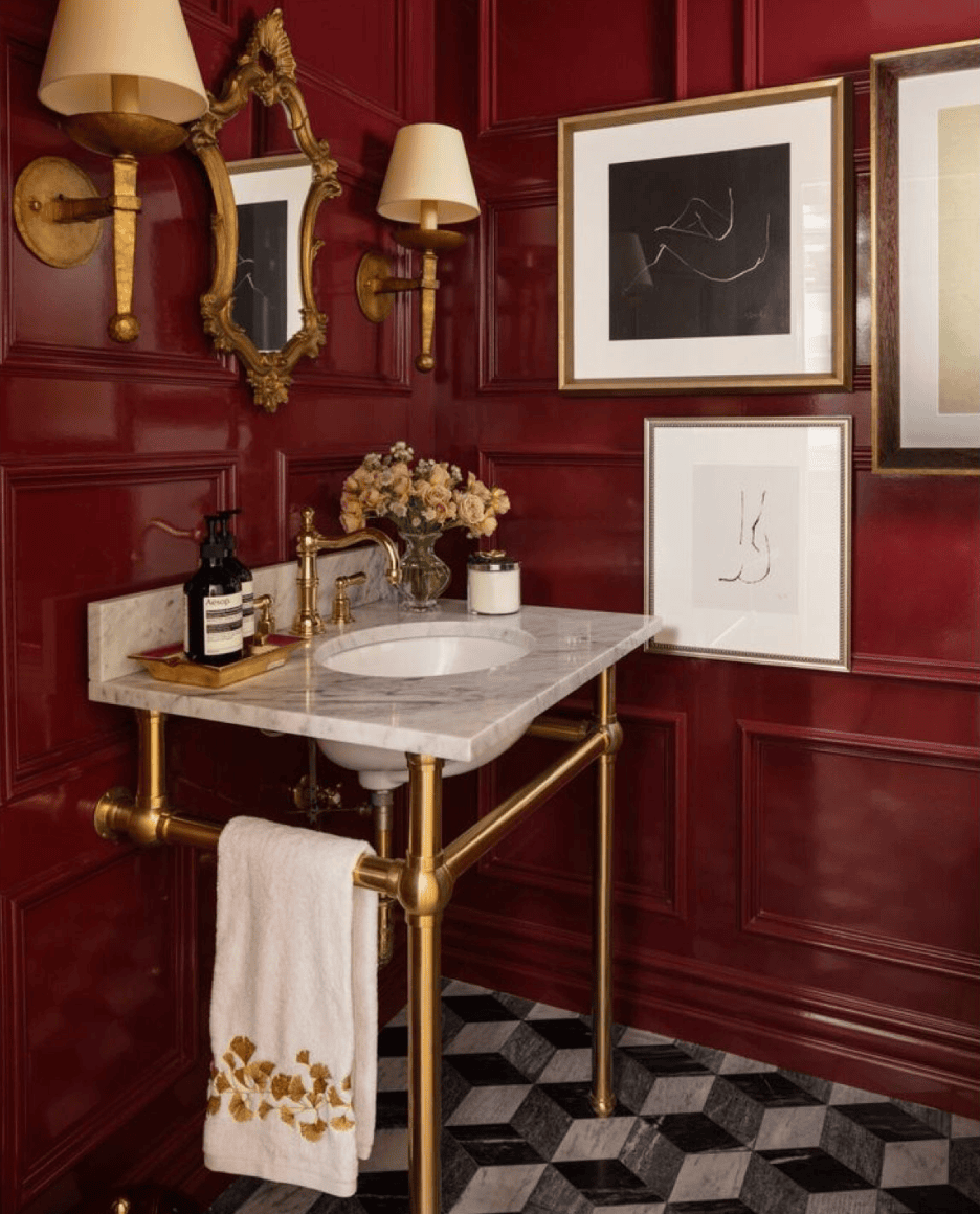
Gone are the days when safe, neutral interiors ruled the roost. Today’s leading designers are embracing bold color — not as an afterthought, but as the very foundation of memorable, expressive spaces. Whether you’re dreaming of a vibrant living room or curious how daring hues can shape mood and style, there’s both strategy and storytelling behind every successful color pairing.
1. Treat Color as a Narrative
Bold hues work best when they serve a purpose. Top designers plan palettes as if they were crafting a story — each color has a role, whether it’s to calm, energize, or create rhythm. For example, a Paris apartment featured cherry red for excitement, sea green for tranquility, and acid yellow to energize the flow — all unified against a neutral backdrop.
Design Tip: Ask yourself what emotion you want the room to evoke. Let that guide your initial palette.
2. Accent Boldly — with Restraint
Using vivid tones doesn’t always mean saturating every surface. Instead, designers often let color play the supporting role:
Deep purples and mossy greens ground a space.
Pale blue walls offer breathing room.
Unexpected pops, like red door frames, act as visual “echoes” between spaces.
Design Tip: Think of bold accents as punctuation — they should enhance, not overwhelm.
3. Be Intentional — Don’t Let Color Happen by Accident
Bold color loses impact when it feels haphazard. Purposeful use — whether it’s to add warmth, define mood, or reflect personality — gives confidence to daring schemes. One home balanced deep blues, spicy oranges, and even leopard print because the palette told a cohesive story aligned with the homeowner’s spirit. Architectural Digest
Designer Mindset: Before choosing a hue, decide why you’re choosing it.
4. Connect Hues Across the Space
A key to harmony is weaving color through unexpected places. In one Brooklyn brownstone, sage green in the kitchen was paired with burgundy — but it was the backsplash that visually tied these bold moves together.
Design Tip: Use a unifying element (like tile, fabric, or trim) to bridge contrasting colors.
5. Use Bold Hues to Energize Neutrals
Neutral walls aren’t a limitation — they’re an opportunity. Designers often use a vibrant rug or strong accent piece to “wake up” an otherwise calm backdrop. A cobalt blue rug, for instance, becomes the launchpad for layering olive green sofas and graphic black-and-white chairs.
Design Tip: Neutral walls + bold accents = dynamic, balanced spaces.
Bonus: Principles from Color Theory
While Architectural Digest focuses on design professionals’ approaches, timeless principles from color theory can help make bold pairings feel intuitive:
Value matching: Colors of similar intensity or brightness tend to harmonize even if they’re unexpected.
Contrast with cohesion: Pairing light and dark values with similar undertones gives drama without chaos.
Balance through proportion: Applying the classic 60-30-10 rule — dominant, secondary, and accent hues — can keep exuberant palettes grounded.
In Summary: Bold Doesn’t Mean Reckless
Pairing vibrant colors isn’t about throwing together whatever catches your eye. It’s a nuanced process grounded in intention, rhythm, and balance. Bold color shines when it’s tied to story, thoughtfully accented, and harmonized through repeated visual cues.
So go ahead: mix that chartreuse with terracotta, balance emerald with burgundy, or turn a bright rug into your room’s heartbeat. When color is intentional, every room becomes an experience.
Would you like real-world palette examples or a printable guide to help readers pair bold colors with confidence? Let me know!
